Job detail page (/jobs/:company/:slug)
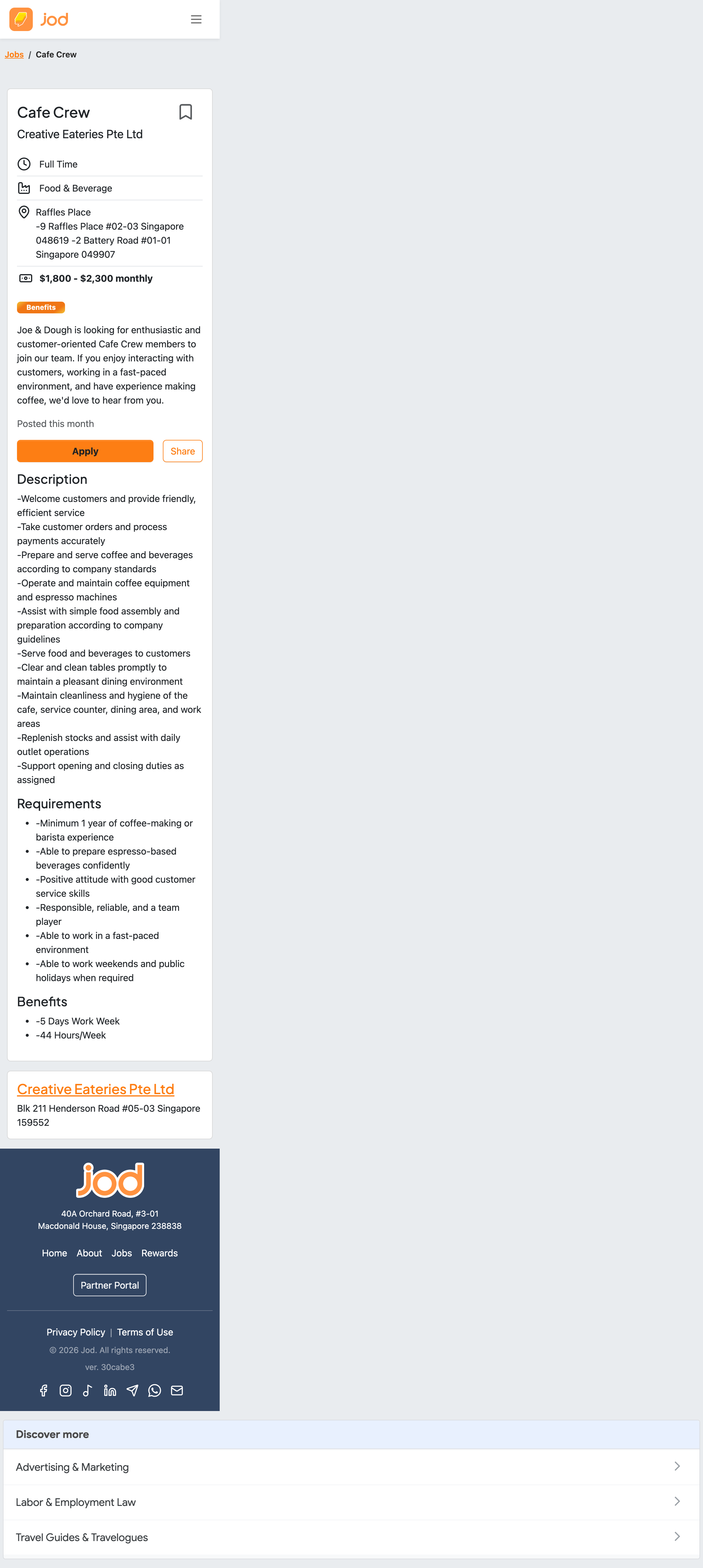
Reviewed on the smallest common viewport (iPhone SE) because that is the honest case for our seekers. This is an information-side product in Garrett's duality: the seeker is here to read, scan, and decide.
Plane 1 — Strategy
User need: a blue-collar seeker, on a phone, often between shifts, wants to answer three questions fast: what is the job, what does it pay, can I get there? Then one action: apply.
Business need: applications started — plus ad revenue (an AdSense unit renders mid-page). These two needs are in direct tension on this page, and the layout currently resolves the tension in the ad's favour: the ad block sits immediately above the only Apply button.
Judgement: the page should optimise for the application; the ad follows the content, never interrupts the action. A seeker who applies is worth more than an impression.
Plane 2 — Scope
Content on the page today: title, company, employment type, category, address(es), pay range, benefits badge, summary, posted-date, Apply/Share, description, requirements list, benefits list, company card, footer, "Discover more" article links.
- Strength: the essentials set is right, and pay is shown when the employer allows it — that is ahead of many job boards.
- Gap — nothing helps the "can I get there?" question beyond a text address. A map link (even a plain Google Maps URL) is cheap scope with direct decision value for shift work.
- Gap — no related jobs. The only onward paths are generic articles under "Discover more". A seeker who reads this far and does not apply is our best prospect for another job at the same company or in the same area; today we hand them articles instead.
- Question — company signal. The company card shows a name and an address.
StarRatingexists in the design system but nothing on this page tells a seeker whether the employer is good to work for. Whether we can honestly fill that signal is a product decision — flagging, not prescribing.
Plane 3 — Structure
- Strength — essentials-first hierarchy. Title → company → type → category → address → pay → benefits → summary, all in the first card. A seeker can decide "not for me" in five seconds without scrolling. This structure is correct; keep it.
- Finding — one Apply chance per page. After the essentials card, the description, requirements, and benefits push on for several screens with no second Apply and no sticky action. The seeker most convinced by the full description ends furthest from the button. A sticky bottom bar (Apply + pay summary) or a repeated Apply after the benefits section is the highest-value structure experiment on this page.
- The breadcrumb (
Jobs / Cafe Crew) and the bookmark action are both present and correctly placed.
Plane 4 — Skeleton
Information design is where this page visibly leaks employer input straight to seekers:
- Double bullets. Requirements and benefits render as
• -Minimum 1 year of coffee-making...— employers type leading dashes, andBulletedListFromTextadds bullet markers on top. The fix belongs at render: strip leading-,•,*from each line before adding our own markers. We should not try to re-train every employer's typing habits (the form already says "list each requirement on a new line" and employers still add dashes — meet them where they are). - The description block shows raw dashes and raw line breaks for the same reason, reading as a wall of hyphenated fragments rather than a list.
- Concatenated outlet addresses. Two outlets render as one run-on line:
-9 Raffles Place #02-03 Singapore 048619 -2 Battery Road #01-01 Singapore 049907. One address per line at minimum; "which outlet is nearest to me" is a later, better answer. $NaNpay (jodapp-web#1317). A one-sided pay range renders$1,800 - $NaN monthlyon this very card. Nothing erodes trust in pay data faster than a visibly broken number in the most important line on the page.- "Posted this month" is honest and adequately vague — no change needed.
Plane 5 — Surface
- The card hierarchy (white cards on grey, navy footer) is clean, and the gradient Benefits badge is a good brand moment — it marks exactly the differentiating content.
- Body text for the description runs small and dense for long reading on a small phone; the design system's type scale has room to breathe here without redesign.
- The Apply button is properly brand-orange and full-width; whatever the structure experiment decides (sticky bar or repeated button), the visual treatment is already right.
What to prototype in Claude Design
All components exist in the Jod Design System: CareersJobDetailView, CareersJobPay, BulletedListFromText, EntityAvatar, StarRating, WhatsappButton, the badge patterns.
- Sticky bottom Apply bar with the pay line.
- Normalised requirements/benefits lists (single bullets, no dashes) — pairs with the render-side fix.
- One-address-per-line outlet block with a map link.
- A "More jobs at this company / nearby" module in place of, or above, "Discover more".